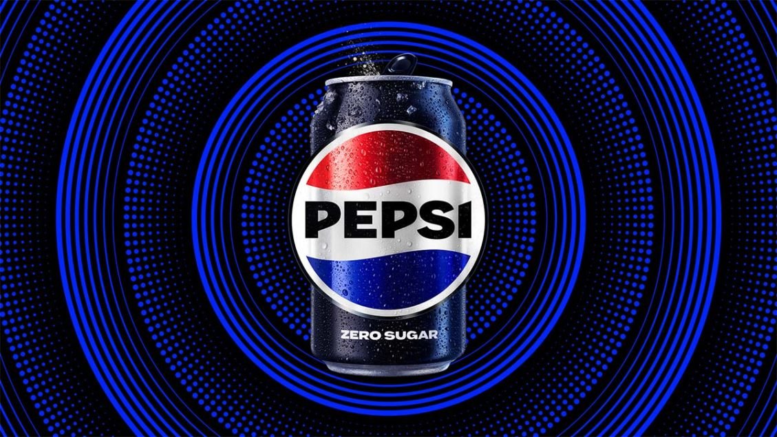
Global beverage brand, Pepsi has unveiled a new logo and visual identity, its first significant rebrand in 14 years.
The logo and visual identity are said to borrow equity from the soda’s 125-year history and incorporate modern elements to create a look that is “current and undeniably Pepsi”, the brand said. The new design showcases a bold typeface, signature pulse and an updated colour palette to highlight the brand’s commitment to Pepsi Zero Sugar.
According to Pepsi, the new design evolves the brand to represent its “most unapologetic and enjoyable qualities”. The rebrand will span across all physical and digital touchpoints, including packaging, fountain and cooler equipment, fleet, fashion and dining.
Key design changes
Among the key design updates, the Pepsi globe and wordmark will unite to emphasise the distinctive Pepsi branding, and a bolder custom typeface reflects the brand’s “confidence and unapologetic mindset”, differing from the current version’s soft, lower-cased letters.
An updated colour palette introduces electric blue and black to bring contrast, vibrancy and a contemporary edge to the classic Pepsi colour scheme. Given the brand’s continued focus on Pepsi Zero Sugar as a growth driver, the new design brings in the colour black, which is already used on the Zero Sugar packaging.

A Pepsi “pulse” motif has been introduced to reflect a sense of movement and the “ripple, pop and fizz” of the soda. It also brings “the rhythm and energy of music”, an important and continuing part of the Pepsi legacy, the brand said.
Pepsi also said that the new “visually distinct can silhouette” is designed to hero the Pepsi can as an accessible brand for all.
The new brand identity will be rolled out in North America this autumn in time for the brand’s 125th anniversary, followed by global introduction in 2024.
New era for Pepsi
Pepsi said that in an increasingly digital world, the revitalised design introduces movement and animation into the visual system, unlocking more flexibility for Pepsi to move between physical and digital spaces, from retail shelves to the metaverse. It also allows for more seamless and creative collaboration with partners and retailers and more versatility to engage fans in the places they shop, dine, work and play.
“Pepsi is an iconic brand that is constantly evolving with the times, as it has been a staple in pop culture and disrupted the category for the past 125 years. We couldn’t be more excited to begin a new era for Pepsi, as this exciting new and modern look will drive brand distinction to show up bigger and bolder and help people find new ways to unapologetically enjoy the things they love.
“This new visual system brings out the best of the Pepsi brand’s rich heritage, while taking a giant leap forward to set it up for success in an increasingly digital world,” said Todd Kaplan, chief marketing officer at Pepsi.
“At PepsiCo, we design our brands to tell a compelling and holistic story. Pepsi is a shining example of a brand that has consistently reinvented itself over 125 years to remain a part of pop culture and a part of people’s lives.
“We designed the new brand identity to connect future generations with our brand’s heritage, marrying distinction from our history with contemporary elements to signal our bold vision for what’s to come.” Mauro Porcini, SVP and chief design officer of PepsiCo added
